Introduction
In the world of data visualization, two terms often come up: data storytelling and data framing. While both are crucial for effective communication, they serve different purposes. Understanding the difference can help you create more engaging and insightful dashboards, especially when using tools like Looker Studio. In this blog, we’ll break down these two concepts, explain how they differ, and explore how to apply them effectively in your data dashboards.
What is Data Storytelling?
Data storytelling is the art of narrating data insights to guide the audience through a specific narrative. It involves selecting data points, visualizations, and annotations to craft a cohesive story that explains what the data is showing, why it matters, and what actions should be taken.
Key Elements of Data Storytelling:
- Context: Setting the scene by providing background information to help viewers understand why the data matters.
- Narrative Flow: Crafting a logical sequence that guides the viewer from one insight to another.
- Visuals with Purpose: Using charts, graphs, and visual elements to emphasize key data points and trends.
- Call to Action: Clearly communicating what actions the audience should take based on the data insights.
Example: In Looker Studio, a data storyteller might create a dashboard that shows the rise of sales across different regions, highlights a drop in a specific region, and explains the reasons behind it, leading to a recommended action plan.
What is Data Framing?
Data framing, on the other hand, is about structuring data in a way that emphasizes particular aspects, providing a specific angle or perspective on the data. Unlike data storytelling, data framing doesn’t necessarily guide the audience through a linear narrative. Instead, it sets up the data in a way that allows viewers to explore and draw their own conclusions based on the focus or emphasis placed on certain metrics.
Key Elements of Data Framing:
- Emphasis: Highlighting particular data points, metrics, or comparisons that you want to bring attention to.
- Simplification: Making complex data more digestible by framing it in a straightforward, accessible way.
- Flexibility: Allowing the audience to interact with the data and explore different aspects.
- Comparisons: Framing data to make it easier for viewers to compare different data sets, trends, or segments.
Example: In Looker Studio, a data framer might set up a dashboard that shows various performance metrics, such as sales, customer engagement, and profit margins. Each metric is emphasized separately, allowing users to drill down into specific details and explore comparisons without guiding them through a specific narrative.
Data Storytelling vs. Data Framing: Key Differences
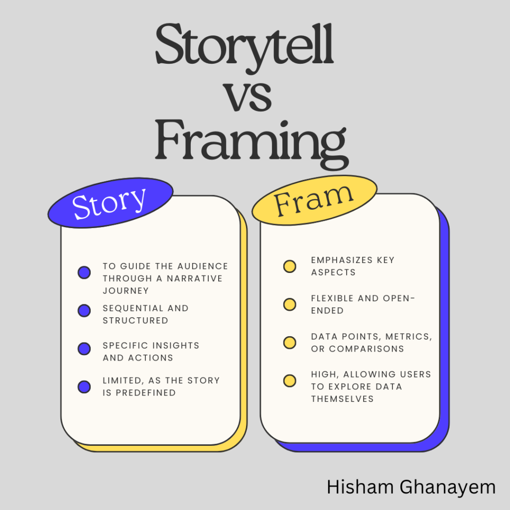
| Aspect | Data Storytelling | Data Framing |
|---|---|---|
| Purpose | To guide the audience through a narrative journey | To present data in a way that emphasizes key aspects |
| Approach | Sequential and structured | Flexible and open-ended |
| Focus | Specific insights and actions | Data points, metrics, or comparisons |
| Audience Interaction | Limited, as the story is predefined | High, allowing users to explore data themselves |
Applying Data Storytelling and Framing in Looker Studio
Now that we understand the differences, let’s look at how you can apply these concepts when creating dashboards in Looker Studio.
1. When to Use Data Storytelling
- Annual Performance Reviews: Use storytelling to guide stakeholders through a year’s performance, highlighting successes and areas for improvement.
- Campaign Analysis: Show the progress and results of a marketing campaign, leading to a conclusion about its effectiveness.
- Business Reports: Create a story that explains how different factors contributed to the overall business results.
Example in Looker Studio: A dashboard that starts with an overview of total sales, then drills down into sales by product category, region, and sales channels. The dashboard might include annotations that explain spikes or drops, culminating in a final slide with recommendations.
2. When to Use Data Framing
- Exploratory Analysis: Provide stakeholders with the tools to explore data on their own, such as filters and interactive charts.
- Real-Time Monitoring: Set up dashboards that highlight key metrics without guiding the viewer, allowing them to focus on what matters most at the moment.
- Comparative Analysis: Present data sets side-by-side so users can easily compare and contrast performance across different segments or periods.
Example in Looker Studio: A dashboard that displays customer behavior metrics (e.g., session duration, bounce rate, conversion rate) by device, location, and referral source, allowing users to filter and explore each category independently.
Tips for Effective Data Storytelling and Framing in Looker Studio
- Choose the Right Visuals: Use visuals that best suit your goals—line charts for trends, bar charts for comparisons, and pie charts for parts of a whole.
- Utilize Annotations and Text: In storytelling, annotations can guide the viewer, while in framing, clear labels help users understand what they’re seeing.
- Emphasize Key Data: Use colors, shapes, and other visual elements to draw attention to important data points.
- Allow Interactivity: Provide filters, drill-downs, and other interactive elements so users can explore the data further.
Conclusion
Both data storytelling and data framing play important roles in data visualization. While storytelling is ideal for guiding your audience through a cohesive narrative, framing empowers them to explore and interpret the data themselves. Knowing when to use each approach—and sometimes combining elements of both—can make your Looker Studio dashboards more impactful and engaging.
Supporting links
Free courses: Enroll here
Additional read: Read here


